I’m trying to embed a Google Maps iframe into a page on my site, but I’m not sure if I’m using the right code or settings. The map either doesn’t load correctly or doesn’t display at all on mobile. Can someone walk me through the proper way to generate and embed a Google Maps iframe, including any responsive or SEO best practices I should know about?
First thing, make sure you are using Google’s own embed code, not some half‑copied snippet.
-
Get a clean iframe from Google Maps
- Open maps.google.com
- Search your address or place
- Click Share
- Click “Embed a map”
- Pick size
- Copy the iframe code, it looks like:
-
Make it responsive so it works on mobile
Replace fixed width with 100%, and use a wrapper to keep ratio.HTML:
CSS:
.map-container {
position: relative;
width: 100%;
padding-bottom: 56.25%; /* 16:9 ratio */
height: 0;
overflow: hidden;
}.map-container iframe {
position: absolute;
top: 0;
left: 0;
width: 100%;
height: 100%;
border: 0;
} -
Common reasons it fails on mobile
- Iframe inside display: none parent then toggled. Some browsers block initial load. Try visibility: hidden instead or load map after open with JS.
- Mixed content. If your site uses https and your map src starts with http, browsers block it. Use https for everything.
- Parent element with fixed height too small. Inspect on mobile and check computed height for the iframe.
- Some page builders strip iframe attributes. Switch to HTML mode or “raw HTML” widget.
-
Check console and CSP
On mobile dev tools, look for content security policy errors. If your site has CSP, you need this in your headers:frame-src https://www.google.com https://www.google.com/maps/embed/;
-
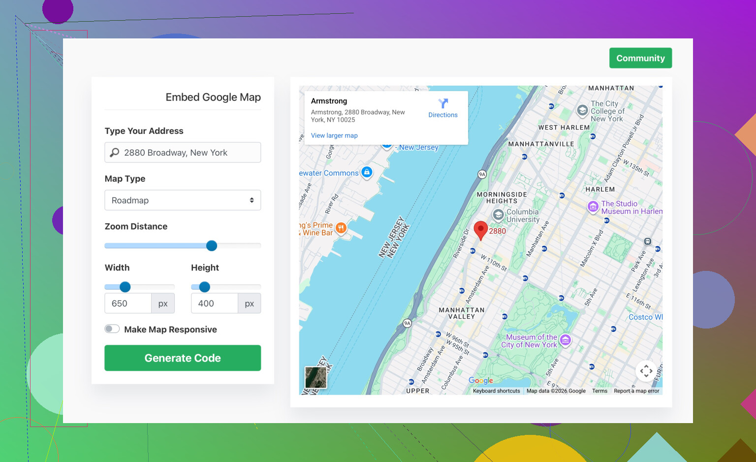
If you do not want to mess with code
Use a generator with responsive options. Something like
easy Google Map embed generator for your website
It gives you ready iframe or responsive snippet so you plug it into your page.
If the map still does not show, post your iframe code and a link to the page. The exact CSS around the iframe often breaks it more than the map code itself.
5 Likes
You’re on the right track using an iframe, the trick is that Maps itself is usually fine, it’s everything around the iframe that breaks it, especially on mobile.
@sterrenkijker already covered the clean embed and a standard responsive wrapper. I’d look at a few other things that often kill the map on phones:
-
Check for overlays blocking taps / view
In a lot of themes, the map sits inside a section with some fancy effect: gradient overlay, “click shield,” or a z-indexed div on top.- In dev tools (mobile view), inspect the map area.
- If you see some
::beforeor::afterelement or another div withposition: absoluteand a higherz-index, that can totally hide the map even though it’s actually loaded.
Quick test: temporarily setpointer-events: none;on suspicious overlays and see if the map suddenly appears / becomes interactive.
-
Width: 100% is not enough if parents are broken
Even if the iframe itself haswidth: 100%, it will be 0 if any parent has:display: noneon initial load, orwidth: 0ormax-width: 0, or- is stuck in a flexbox that collapses the child.
Check every parent container in dev tools and verify the computed width and height on mobile. If the parent is 0, fix that first (often a page-builder column setting or a “hidden on mobile” rule).
-
Test without your theme / builder fluff
Page builders love to mess with iframes. To rule that out:- Create a super simple test page with just:
<div style='width:100%;max-width:800px;margin:0 auto;'> <iframe src='YOUR_GOOGLE_MAPS_EMBED_SRC' style='border:0;width:100%;height:300px;' loading='lazy' allowfullscreen referrerpolicy='no-referrer-when-downgrade'> </iframe> </div> - View that on your phone.
If it works here but not in your “real” page, the issue is layout / builder settings, not the Google code itself.
- Create a super simple test page with just:
-
Avoid funky lazy load / animation combos
I slightly disagree with relying only onloading='lazy'plus scroll-based animations. Some plugins delay content or animate sections in from off-screen which can confuse iframe sizing.
Try disabling:- scroll animations,
- “load on scroll” / “lazy section” plugins
around the map. If the map appears after disabling that stuff, then you’ll need to: - either exempt the map section from those effects, or
- manually trigger a reflow after the animation (more advanced JS route).
-
Check if you’re accidentally using Directions or Share link instead of Embed src
Make sure the src actually starts with something like:
https://www.google.com/maps/embed?pb=...
If the URL looks likehttps://www.google.com/maps/place/...without/embedor?pb=, that might still work in some cases but is not the correct embed endpoint and can be flaky inside iframes. -
If you’re using a strict privacy plug‑in or cookie banner
Some GDPR / privacy tools block Google domains until consent is given. On desktop you might have already clicked “accept” in a previous session, but on mobile you’re basically a new visitor with blocked third‑party content.- Temporarily disable the privacy / cookie plugin.
- Hard refresh on mobile.
If the map suddenly works, configure your tool to allowgoogle.comandgoogle.com/mapsfor iframes after consent.
-
Viewport meta tag
Rare but I’ve seen a totally broken<meta name='viewport'>cause absurd scaling so the map is there, but appears like a 1px strip you don’t notice. Make sure you have something sane like:<meta name='viewport' content='width=device-width, initial-scale=1'>
If you want an easier starting point than fiddling with your builder, there’s a handy tool:
create a responsive Google Map embed for your website
It spits out iframe code that usually just works, and you can drop that into your page to see if the problem is your current code or the surrounding CSS.
If you can share the exact iframe snippet you’re using and what platform/theme you’re on (WordPress + which theme, custom HTML, etc.), people here can probably point at the exact line causing your mobile issue in about 10 seconds.
Check two things everyone usually overlooks:
1. Your HTML context (doctype + charset + viewport)
Maps iframes behave weirdly inside “broken” documents. Make sure the page that holds the iframe starts like:
<!doctype html>
<html lang='en'>
<head>
  <meta charset='utf-8'>
  <meta name='viewport' content='width=device-width, initial-scale=1'>
  <title>Map page</title>
</head>
<body>
  <!-- map section here -->
</body>
</html>
No quirky user-scalable=no or exotic viewport values. Some mobile issues are just zoom / scaling problems that make the map look like it vanished.
2. How the container scrolls
On mobile, if the iframe is inside a scrollable area with things like:
.parent {
  overflow: auto;
  -webkit-overflow-scrolling: touch;
}
you can get a “ghost” map: it loads, but you barely see it or cannot scroll inside. Try:
- making the map section not the child of a scrollable div, or
- changing that specific section to
overflow: visible.
This is where I slightly disagree with just wrapping it once and calling it done. On many builders, you end up with a wrapper inside a column inside a slider inside a scrollable panel. Each level can clip or resize the iframe.
About using a generator like easy Google Map embed generator for your website
If you do not want to debug all of the above, those generators are useful:
Pros
- Quick: paste address, get ready iframe or responsive block.
- Usually adds sane defaults for width, height, lazy loading.
- Good for testing whether the problem is your code or the surrounding layout.
Cons
- Less control over performance tweaks or advanced attributes.
- You still have to ensure your theme / builder does not strip or rewrap the code in a strange way.
- If you later redesign, you may have to redo embeds instead of just reusing one clean pattern.
Use it as a diagnostic tool: if their snippet works on a blank test page but breaks inside your actual section, the culprit is 100% your theme, not Google Maps.
@stellacadente and @sterrenkijker covered the core: use the proper /embed URL, responsive wrapper, avoid mixed content, watch for overlays and privacy tools. To move forward, I would:
- Create a minimal test HTML file outside your CMS with just the doctype, viewport, and iframe.
- Open that directly on your phone.
- If it works, start adding your real layout pieces one by one until it breaks. The exact step where it breaks will tell you if it is an overlay, a flex parent, a scroll container, or a plugin.
Post the specific iframe plus a screenshot of the DOM around it (parents and their CSS) and it should be possible to pinpoint the issue very quickly.